Colour Trends In Healthcare Design
Healthcare has long been associated with the colour white: it’s clean and sterile. Doctors wear it, and so do nurses. However, as healthcare design evolves to become more sophisticated and patient-centred, there’s a growing recognition of the importance of fine-tuning colour palettes. Not only do colours have a psychological impact on patients, influencing their recovery speed and likelihood, but they also serve as a communication tool and signalling system among healthcare staff.
Psychological Impacts In The Healthcare Environment
There are several theories about how specific colours impact patients, though it’s important to remember that cultural differences can alter these effects. For instance, red is believed to be energizing and can encourage alertness, making it beneficial for patients with dementia who need brain stimulation. It is also effective in memory care services in senior homes. Conversely, red is not recommended for patients who need rest and sleep, as it can cause anxiety and overstimulation.
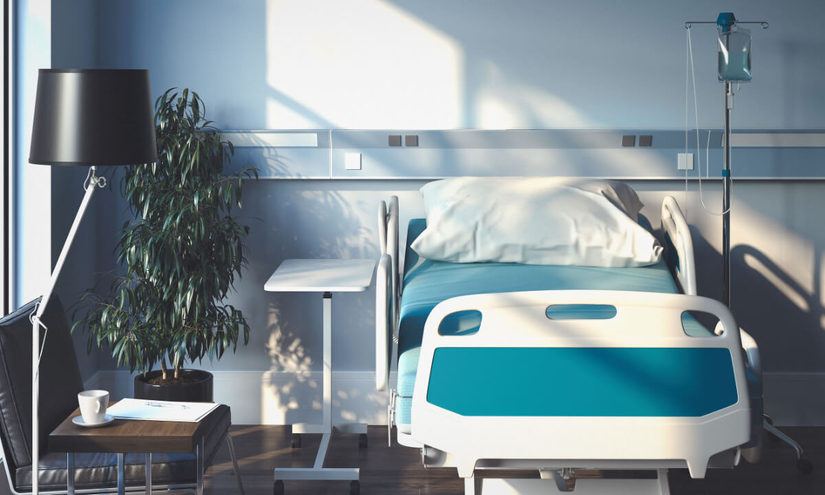
Cool, muted hues like blue, green, and purple are known to be calming and are ideal for hospital rooms, wards, waiting areas, and wellness centers. Equally important is the balance and contrast of different colours and saturations. For example, a room dominated by “cool” colours should be balanced with “warm” but neutral elements like wood to create a harmonious environment.
In retirement facilities, bright red should not be the predominant colour. Instead, incorporating warm, highly saturated hues against dark or neutral backgrounds can create a bright, homey atmosphere. In children’s hospitals or areas where kids can be active and creative, contrasting colours can provide stimulation and signal that being energetic is encouraged in these spaces.
Colour-Coded Signage In Hospitals
Colour-coded signage in hospitals serves as a vital communication tool for staff members. To ensure consistency and clarity, organizations like the International Organization for Standardization (ISO), the Occupational Safety and Health Administration (OSHA), and the American National Standards Institute (ANSI) have established guidelines for these markers.
Red is universally recognized as a signal for danger and an indication to stop. In hospitals, red markers are used to identify emergency protection equipment and apparatus, such as fire exits, fire extinguishers, stop buttons, and electrical switches. This immediate recognition helps ensure quick and effective responses in critical situations.
Green, in contrast, symbolizes safety and is used to denote the location of first aid equipment. Items such as dispensaries, stretchers, and safety deluge showers are marked with green, making it easy for staff to locate essential medical supplies quickly during emergencies.
Orange is used to highlight dangerous parts of machinery or electrical equipment that pose risks of cutting, crushing, or other injuries. Examples include exposed pulleys, gears, rollers, and power jaws. These markers serve as a warning to staff to exercise caution when near these potentially hazardous areas.
Yellow is employed to signify caution and highlight hazards that could result in tripping, falling, stumbling, or getting caught in between objects. This includes construction equipment, handrails, and guardrails. The use of yellow ensures that staff remain vigilant and aware of their surroundings to prevent accidents.
Overall, the strategic use of colour-coded signage in hospitals enhances safety and efficiency, enabling staff to respond swiftly and appropriately to various situations.
Connecting To Nature
In contrast to the sterile and clinical appearance traditionally associated with hospitals, there has been a growing trend towards using healthcare furniture and decor that evoke the essence of the natural world. Warm oranges, soft yellows, and clear blues have been introduced to create a more comforting environment, particularly for patients who require high levels of assistance, such as the elderly. As people age, their vision tends to shift towards a slightly yellow hue, making vibrant colours crucial in lifting their spirits and preventing feelings of melancholy.
Bold And Inspiring
Incorporating bold colours in healthcare design can help patients forge a connection with their new surroundings. Hallways and waiting rooms adorned with distinct colour themes can make it easier for individuals to navigate the healthcare facility, which is particularly beneficial during extended stays. However, it is essential to use these bold colours moderately to avoid overwhelming patients. Feature walls, for instance, can create a positive mood while balancing the overall energy with more soothing neutral tones. These brighter colours are often reserved for waiting rooms and public spaces where the dynamic energy of groups of people can be matched. On the other hand, small, individual rooms may be better suited to more subdued colour schemes to avoid overpowering the space.
Simplicity In Minimalism
Conversely, some healthcare facilities are adopting a minimalist approach to foster an atmosphere of relaxation and calm. Neutral tones in grey and beige cater to a wide range of preferences and are consistent with the traditional clean aesthetic of hospitals. These colour schemes are ideal for patient rooms, where bright colours may not be conducive to rest and sleep, as well as for units where patients need to recover from surgery. To prevent these neutral tones from appearing too clinical, many hospitals are incorporating sandy hues and misty greys, subtly linking back to the serenity of nature.
If you are planning a fitted healthcare furniture project, get in touch with Harkel Office. As one of Ontario’s premier healthcare furniture dealers, we offer customized healthcare furniture solutions that meet your needs and budget. We carry a wide range of hospital furniture in varying colours that can match your exact specifications and aesthetic preferences. Connect with us today.


